

Color is the decision homeowners lose the most sleep over, and it’s easy to see why. Of all the choices that go into an interior house painting project, it’s the one everyone notices, the one that’s hardest to take back, and the one where a small misjudgment shows up on every wall of the room.
The good news is that choosing well is less about having a designer’s eye than most people expect. It’s about understanding a few things that quietly shape how a color behaves once it’s on your walls — the light in the room, the size of the space, the mood you’re after, and how one room flows into the next.
Get those right, and the color card becomes a lot less intimidating.
Start With the Room, Not the Color Card
The most common misstep is falling for a color before thinking about where it’s going to live.
A shade that looks perfect in a showroom or on a phone screen is being shown under conditions your home doesn’t share. Before narrowing down a palette, it helps to take stock of what’s already in the room and isn’t changing: the flooring, the countertops, the trim, a stone fireplace, a sofa you love. Those fixed elements carry undertones of their own, and paint either works with them or fights them.
A warm oak floor and a cool gray wall can feel oddly at odds without anyone being able to say exactly why. Once you know what you’re working around, the field of good options narrows on its own — and that’s a relief rather than a limitation.
Light Changes Everything
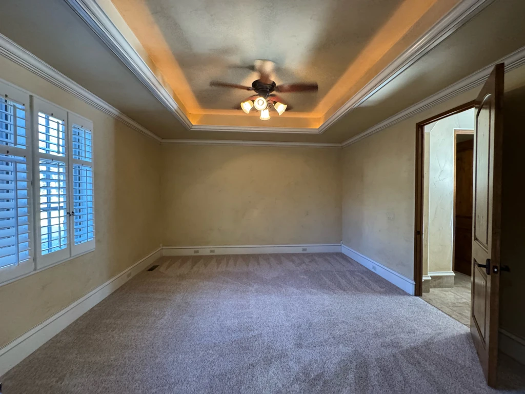
If there’s one thing that surprises homeowners most, it’s why paint colors look different on your walls than they did on the swatch.
Paint doesn’t have a fixed appearance. It reflects whatever light hits it, and that light shifts by the hour and by the direction the room faces. North-facing rooms get cool, indirect light that pulls colors toward gray and can make a warm beige look flat. South-facing rooms get warm light for much of the day, which brings out yellows and can push a soft white toward cream. East and west rooms swing dramatically, bright and warm at one end of the day and dim at the other.
Artificial light adds another layer. Warm bulbs and cool LEDs will render the same color in noticeably different ways, which is why a hallway that looks welcoming at dinnertime can feel sterile under morning sun.
None of this means the color is wrong. It means the swatch was never telling the whole story.
Color Sets the Mood Before Anyone Notices It
Long before someone consciously reacts to a room’s color, they’ve already felt it. That’s the heart of paint color psychology, and it’s worth understanding before you commit.
Cool tones — blues, soft greens, muted grays — tend to slow a space down. They’re a natural fit for bedrooms, bathrooms, and anywhere the goal is rest. Warm tones do the opposite, drawing people together and adding energy, which is why they work so well in kitchens, dining rooms, and the spaces where a family actually gathers.
Deeper, saturated colors bring intimacy and a sense of enclosure, turning a large or echoing room into something that feels like a retreat. Lighter colors open a room up and let it breathe.
None of this is a rule so much as a starting point. A dark, moody dining room can be the most beloved space in a house — as long as it was chosen on purpose rather than by accident.
Room Size, and What Color Does to It
Small rooms are where color choices carry the most weight, because there’s nowhere for a mistake to hide.
Lighter shades reflect more light and visually push the walls outward, which is why they’re so often named among the best paint colors for small rooms — a small bedroom, a powder room, a windowless hallway. But the instinct to paint every small space white isn’t always right either. A rich color in a small room can read as deliberate and enveloping rather than cramped, especially when the trim and ceiling are handled thoughtfully.
Ceiling height matters as much as floor space. Carrying a wall color up onto the ceiling can make a low room feel taller by removing the hard line where the two meet, while a bright ceiling in a tall room keeps things from feeling cavernous.
The point isn’t that small rooms need light colors. It’s that small rooms leave less margin, so the choice deserves more thought.
Why Neutrals Keep Earning Their Reputation
Neutrals get dismissed as the safe choice, and that undersells them.
A well-chosen neutral isn’t the absence of color. It’s a backdrop that lets everything else in a room do its work — the art, the furniture, the light through the windows. The best neutral paint colors tend to land in living rooms, because those are the spaces most likely to change over the years as furniture comes and goes.
What separates a beautiful neutral from a lifeless one is undertone. Grays lean blue, green, or purple. Whites lean warm or cool. Beiges can pull pink or yellow. Two neutrals that look identical on a card can behave like completely different colors on a wall, and the undertone is usually why. This is exactly the kind of distinction that’s hard to see until you have the paint up in the room — which is the whole argument for testing.
When One Wall Deserves the Attention
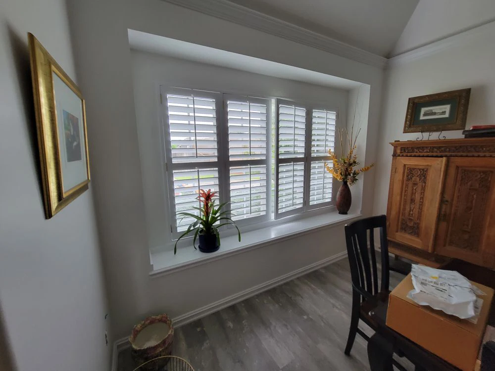
An accent wall works when there’s a reason for it.
The best accent wall ideas start with a wall that already draws the eye — the one behind a bed, a fireplace surround, the wall you face when you walk through a doorway. Each has a natural claim to attention, and a deeper color or richer finish rewards it. An accent wall chosen at random, on the other hand, tends to look like a decision made halfway.
The safest approach is to pull the accent color from something already in the room, a few shades deeper than the surrounding walls. It reads as intentional because it is.
Thinking Past a Single Room
Homes are rarely experienced one room at a time.
You see the living room from the entry, catch the hallway from the kitchen, and glimpse a bedroom through an open door. When each room is chosen in isolation, those sightlines can turn jarring. A whole-house color palette solves this without demanding that everything match. Typically that means a handful of related colors that share undertones, one consistent trim color throughout, and a few rooms where you allow yourself to go bolder.
The result feels calm and considered, and it makes future projects easier, because the palette is already decided.
Live With It Before You Commit
Almost every color regret traces back to a decision made too quickly, from a sample too small.
A two-inch square on a color card gives you almost nothing to judge. Large samples, painted directly on the wall or on a board you can move around the room, tell you far more. Look at them in the morning and again at night. Look with the lamps on. Look at them next to your flooring and against your trim. Notice whether the color you liked at the store still holds up on day three.
Homeowners are often surprised by how much a color shifts across a single day. That’s not a reason for anxiety — it’s simply information, and it’s a lot cheaper to gather before the walls are painted than after.
Choosing Colors With a Team That’s Done It Before
There comes a point where a second opinion is worth more than another weekend of deliberating.
We’ve helped homeowners throughout the entire Tulsa metropolitan area work through exactly these decisions, and we’ve seen what holds up over the years and what people wish they’d done differently. We’ll talk through your light, your fixed finishes, and how you actually use each room, and we’ll be honest when a color you’re drawn to isn’t going to do what you’re hoping for.
Based in Broken Arrow, fully insured, and standing behind our work with a two-year workmanship warranty, we take the same care with the decision as we do with the brushwork. When you’re ready, reach out for a free estimate and let’s find the colors your home has been waiting for.